Phosphor color is the last step in the image
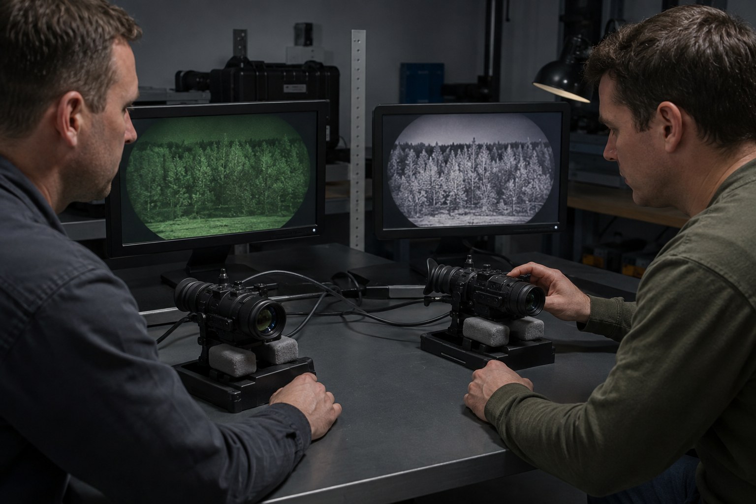
A night-vision device does not see in color in the ordinary sense. Its objective lens gathers limited available light, an image intensifier amplifies and processes that signal, and a phosphor screen converts the result into visible light for the viewer. The screen is where the familiar green or white appearance is introduced.
Green phosphor systems produce an image with green tones ranging from dark green to bright green. White phosphor systems aim for a more neutral grayscale presentation, although the exact appearance can vary between tubes, displays, and viewing conditions. Neither color changes the basic fact that the image was formed from a limited, electronically amplified signal.
This distinction matters because phosphor color is easy to notice, while the characteristics that often determine image performance are less obvious. Resolution, signal-to-noise ratio, gain behavior, blemishes, halo, automatic brightness control, optical quality, and the available light all influence what reaches the eye. A change from green to white phosphor does not automatically upgrade those other parts of the system.
Perceived contrast is not the same as added information
Many viewers describe white phosphor as having a more familiar, photographic appearance. The grayscale presentation can make differences between dark and bright areas feel straightforward to interpret, especially when the scene contains many edges, surfaces, or overlapping shapes. A tree line, building facade, or uneven ground may seem easier to read because the image resembles a monochrome daylight display.
Green phosphor can also provide strong, usable contrast. Its long association with night vision has made it the reference appearance for many operators and observers. Some people find that green separates key shapes effectively, while others find the color less intuitive when judging subtle changes in a complex scene. These are viewing impressions, not fixed rules about how much information the tube contains.
Perceived contrast can be affected by brightness, scene content, adaptation, focus, and the condition of the optical system. A high-quality green tube can reveal more useful detail than a lower-performing white tube. Conversely, a strong white-phosphor system can appear less helpful if the scene is extremely dark, the optics are poorly focused, or the image is dominated by noise. Color can influence interpretation, but it cannot restore signal that was never captured.
Eye comfort depends on context
Comfort is one of the most common reasons people develop a preference. White phosphor’s neutral appearance may feel less visually distinctive for some viewers, particularly during extended observation or when moving between unaided vision and the device. Others prefer green because it is familiar and visually consistent with the equipment they learned on.
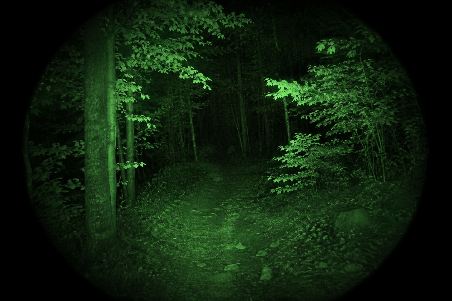
These responses should be treated as individual rather than universal. Brightness settings, the amount of ambient light, the observer’s focus, and the frequency of looking away from the eyepiece can matter as much as phosphor color. A display that is too bright can be distracting in either color. A display that is too dim can make detail difficult to interpret in either color.
It is also useful to separate comfort from performance. A viewer may prefer one color because it feels calmer or more natural, while another color may make particular forms of contrast easier to notice. Preference is still relevant: if a display is tiring or distracting, it may reduce the quality of observation. But comfort alone is not proof that one phosphor is safer, sharper, or objectively better for every eye.
Training changes what looks natural
People learn the visual vocabulary of the systems they use. Someone trained primarily with green phosphor may quickly understand its brightness relationships, recognize common image artifacts, and know what level of detail is realistic in different conditions. The same person may initially find a white image unfamiliar, even if the underlying tube performance is comparable.
White phosphor can shorten the adjustment period for viewers who are accustomed to grayscale displays, but familiarity with ordinary grayscale images does not replace night-vision training. The device still has a restricted field of view, limited depth cues, focus requirements, and artifacts that can mislead an inexperienced observer. A neutral-looking image can feel intuitive while still requiring careful interpretation.
When people or teams use more than one system, consistency can be valuable. Training with the same phosphor color, controls, optics, and image behavior reduces one source of variation. If equipment must be shared, time spent learning how each display renders shadows, highlights, noise, and glare is more useful than assuming that color alone predicts performance.
Tube quality remains the larger variable
Phosphor color should be considered separately from tube quality. Two devices with the same green phosphor can differ noticeably in resolution, noise, gain, blemishes, brightness response, and low-light behavior. The same is true of two white-phosphor devices. Even within a single phosphor category, the visible image can range from clean and detailed to soft, noisy, or uneven.
Image artifacts deserve particular attention. Fixed dark or bright spots, edge distortion, scintillation, blooming around bright lights, and a visible halo can affect how easily a scene is interpreted. Some artifacts are inherent to the intensifier or display, while others may be related to optics, focus, or operating conditions. Changing phosphor color does not remove these limitations.
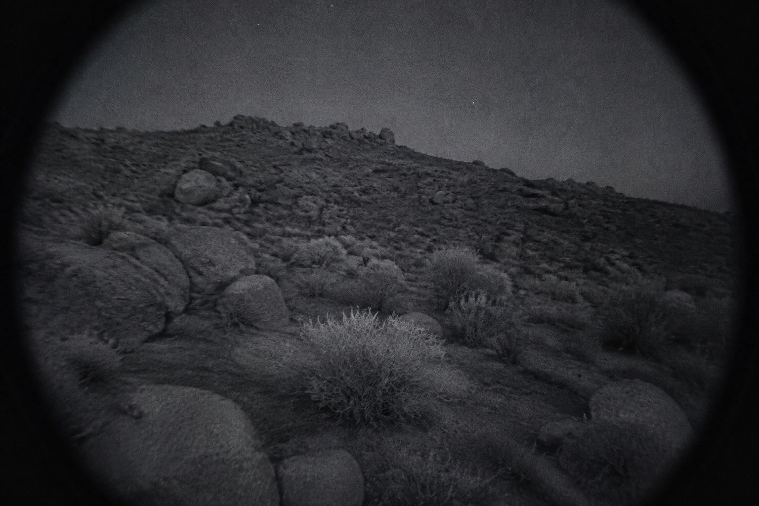
Specifications can help describe a system, but they do not fully predict the viewing experience. Numbers should be understood alongside the intended environment and the complete device. A tube with excellent resolution may not appear dramatically better in a scene with very little light. A system with more visible noise may still be useful when the scene contains enough structure and contrast to separate important shapes.
Matching the display to the task
For casual observation, wildlife viewing, property inspection, and other non-tactical uses, the practical question is often which display permits steady, accurate interpretation over the expected viewing period. A person who frequently shifts between unaided vision and night vision may value a neutral grayscale image. Another observer may prefer the familiar character of green and find it easier to maintain attention with that presentation.
For safety-sensitive work, color should be only one part of the evaluation. The user should be able to identify obstacles, people, changes in terrain, and bright-light hazards without overconfidence. Night vision narrows awareness and can make distances or surface conditions difficult to judge. Safe movement requires appropriate illumination, cautious speed, clear communication where relevant, and compliance with local rules. The display color does not remove those responsibilities.
For any use involving mounted equipment or tools, safe handling and proper training take priority over image preference. Night vision can support observation, but it should not encourage hurried movement, unsafe identification, or decisions based on an unclear image. Keeping the device focused, managing brightness sensibly, and recognizing when the scene is beyond its useful limits are more important than choosing a fashionable phosphor color.
There is no universal winner
Green and white phosphor are different presentations of night-vision information, not competing guarantees of image quality. White may feel more natural or make some contrast relationships easier to read. Green may feel familiar, comfortable, and readily interpretable for viewers trained with it. Both can produce excellent or disappointing results depending on the tube, optics, environment, and user.
The most reliable comparison keeps the variables separate. Consider phosphor color as a viewing preference, then assess tube performance, optical clarity, image artifacts, controls, ergonomics, and the conditions in which the device will be used. If possible, compare systems while viewing similar scenes rather than judging them only under bright indoor lighting.
In the end, the useful question is not which color wins in the abstract. It is which complete system gives a particular viewer a clear, comfortable, and appropriately cautious understanding of the scene without confusing a different visual style for additional information.